
Context & Product Vision
The idea of a single ecosystem where everything revolves together
Behind every advertising execution lies a system of interdependent processes — from planning and negotiating ad space to collecting and analyzing performance data.
Working on Gravity, I discovered just how complex the advertising world is: an ecosystem filled with professionals with diverse skills, fragmented processes, and highly specific needs.
The challenge was exactly this: to transform a scattered system into a platform capable of integrating data, simplifying workflows, and making collaborative what was once fragmented.
Brand & Product Identity
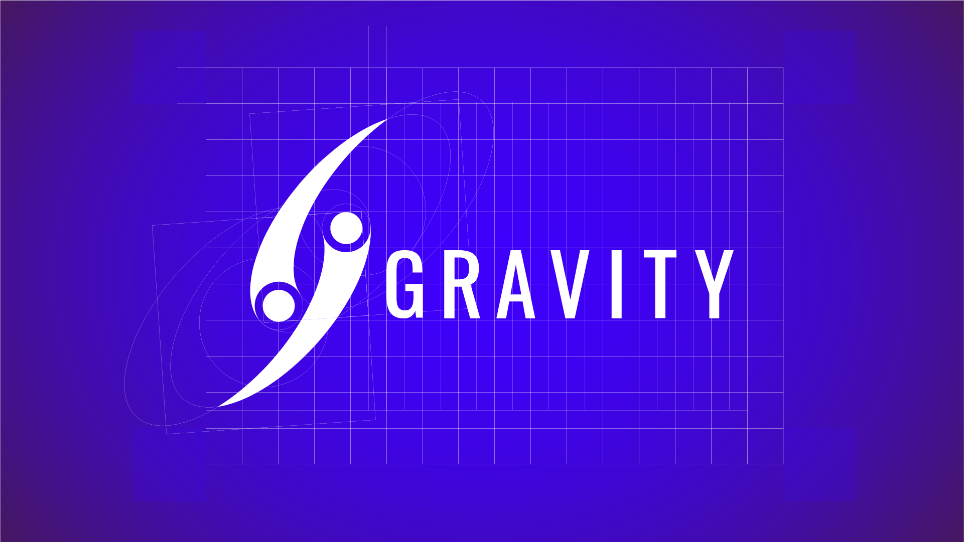
“The Gravitational Force”
as a Principle of Connection
For the Gravity brand, I wanted to represent the attraction between the two main worlds of advertising: media owners and advertisers.
The goal was to create a common center of gravity — a platform capable of making them interact in balance.
This idea gave birth to the name Gravity.
The monogram, a stylized G, represents two spherical entities attracting each other, leaving a trail behind.
The visual concept is inspired by binary systems in astronomy, where two celestial bodies orbit around a shared point. The trails become a metaphor for the data tracking system: a continuous and precise flow that the platform delivers through reports and dashboards, making the movement of the entire advertising ecosystem visible.
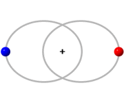
Binary system rotating around
a shared center of mass.
a shared center of mass.
UX Strategy & Information Architecture
A system where the power of data is expressed in a simple, navigable way
To design Gravity, I started with user personas, aiming to observe their real journeys and understand how they move within the advertising world. For a software built to connect all the services needed to manage campaigns in a single platform, this complexity was the most stimulating challenge.
Reconstructing interaction flows over time and identifying friction points and interruptions allowed me to define ideal paths, modularize them, and translate them into coherent and truly useful features.
In collaboration with the CTO, I oversaw the platform’s data modeling and architecture, defining entities, relationships, and update rules. Every table, field, and label was designed to ensure semantic consistency between front-end and back-end, transforming technical structures into simple, navigable experiences.
UX became the bridge between technical complexity, operational needs, and interface clarity.
Every flow — from campaign creation to results analysis — was designed to reduce cognitive load, maintain operational continuity, and make interactions smooth, natural, and human.
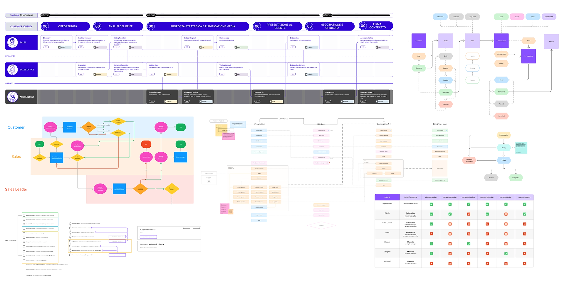
I swear these are the prettiest and tidiest diagrams I’ve ever made :D
Design Process & Methodologies
Design as a Shared Way
of Working
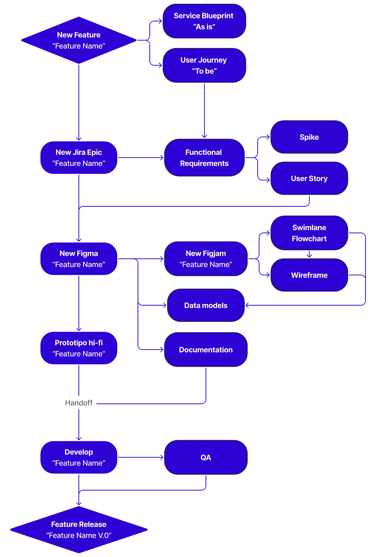
To meet business needs, I aligned my work with Agile rhythms, based on rapid iterations, continuous feedback, and constant dialogue with development. In a growing project like Gravity, cross-functional collaboration and a shared vision proved essential: design, product, development, and QA worked in synergy, sharing goals and responsibilities.
To facilitate communication between teams, Design Ops practices made the process more scalable and sustainable over time:
- Continuous documentation of flows and UI rules
- Shared naming system across Figma, Jira, and code
- Version management
- Visual quality control and operational guidelines for QA
This approach ensured that during hand-off, the development team clearly understood technical specifications, interaction logic, and micro-details.
Design System & Scalability
Consistency and Speed
in Design and Development
The Gravity interface is built on a modular design system, capable of maintaining a strong visual identity while evolving organically and scalably.
The component library follows atomic design principles, with clear hierarchical levels and a structure designed to be expandable.
I managed design tokens and Figma Variables for typography, colors, spacing, interactive states, and light/dark modes, aligning them with the front-end code through Tokens Studio.
Each component was documented with behavior rules, examples, and development notes, ensuring constant dialogue between designers and developers.
The design system became a true tool for visual and functional governance — an infrastructure that allows faster design, fewer errors, and greater consistency.
Seeing the team use it independently, expand it, and keep it alive over time was one of the most tangible achievements of the project.
Releases & Continuous Improvement
Validation Not as a Final Phase,
but as a Constant Mindset
Once the MVP features were implemented, a cycle of continuous observation and validation began, combining qualitative and quantitative analysis.
I conducted usability tests, gathered direct feedback from user testers, and analyzed behavioral metrics such as completion rates, error rates, and navigation times.
Every insight generated new iterations: simplifications, micro-interaction improvements, visual hierarchy optimizations, and performance enhancements.
Over time, the product became increasingly fluid and responsive, not only technically but also in the way it interacts with its users.
Continuously observing, learning, and listening to user needs every day drives ongoing improvement and evolution, growing alongside the real user experience.
And to wrap up…
I’ll let you peek through the mockups.
For confidentiality reasons, some project details have been modified or omitted.
The solutions shown still accurately reflect the process and contribution made.
The solutions shown still accurately reflect the process and contribution made.